Context
Visual identity for a Swedish Star Citizen community, developed to create a distinctive presence within the game’s futuristic universe.
Challenge
The goal was to merge Nordic mythology with Star Citizen’s futuristic aesthetic in a way that feels distinctive, immersive, and true to the game world.
Approach
I created a visual system that combines mythic references with sci-fi precision — resulting in an identity that feels grounded, atmospheric, and future-facing across digital and visual touchpoints.
A faction identity rooted in myth
The identity was developed for a Swedish Star Citizen community looking for a distinctive presence within the game’s universe. Rather than building a generic sci-fi brand, the goal was to create something that feels culturally grounded and internally coherent. Nordic mythology became the conceptual anchor — not as decoration, but as a way to give the faction a stronger symbolic depth. Combined with the visual language of Star Citizen, this created a system that feels both rooted and futuristic without breaking immersion.
Designed as a world you can belong to
A key part of the project was to make the identity feel participatory rather than purely representational. The visual language was built to support the idea of belonging — giving members a sense of alignment, role, and shared direction within a larger fictional world. This is where mythology and game culture meet most directly: not in nostalgia, but in the creation of a collective identity. The result is a brand experience that feels less like surface styling and more like an entry point into a faction with its own logic, symbolism, and tone.

Borrowing from the language of in-game systems
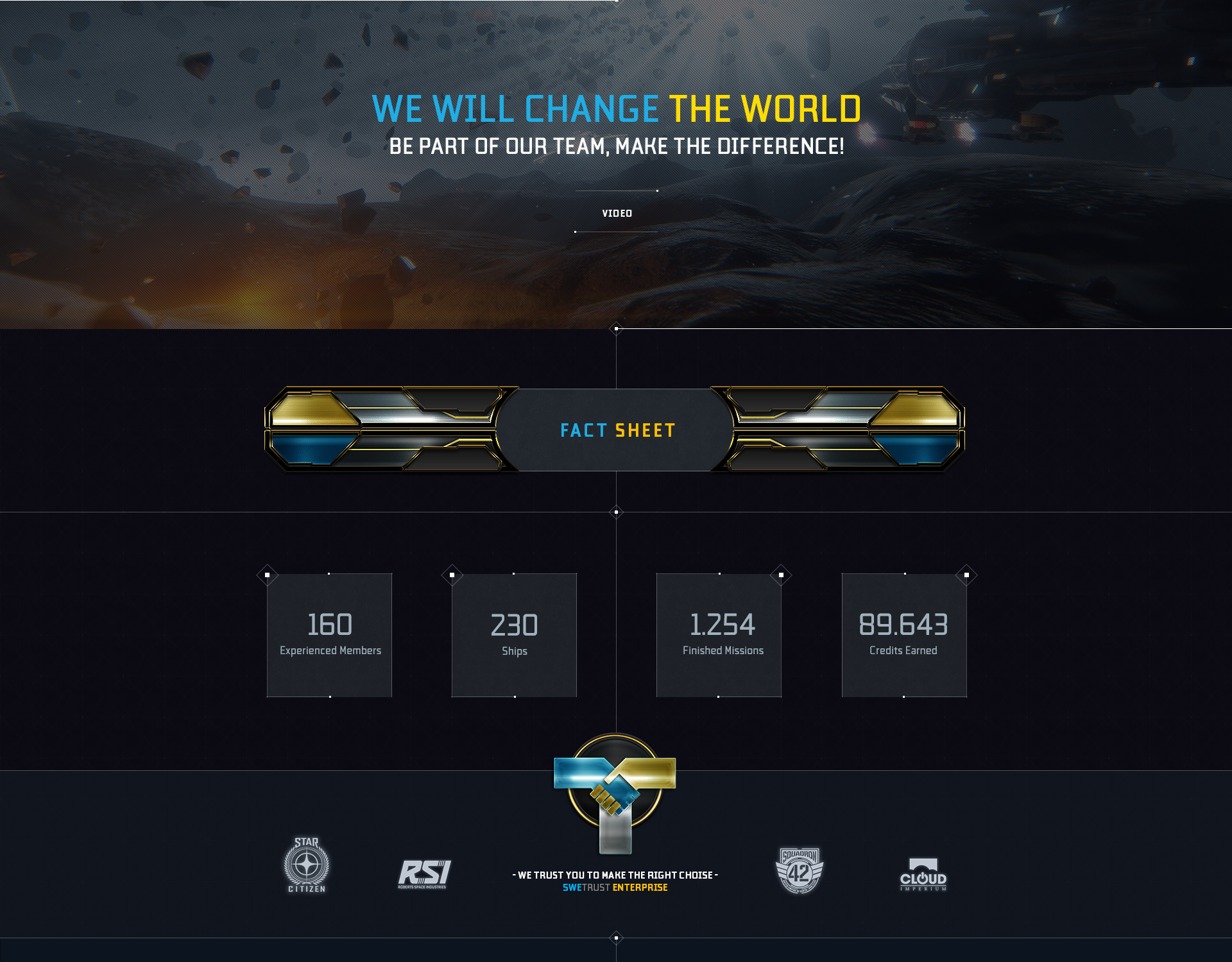
To stay immersive, the design needed to feel native to Star Citizen’s visual world. Elements inspired by interface systems, signal distortion, targeting overlays, and layered screen graphics helped ground the identity in a familiar sci-fi grammar. These cues create a stronger connection to the game without relying on imitation alone. Instead, they act as a bridge between the faction’s own mythology and the technical atmosphere of the universe it exists in.
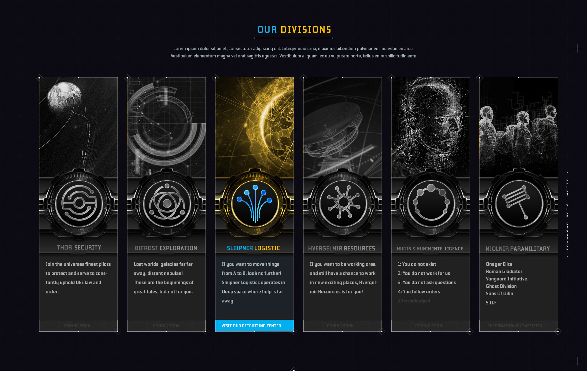
Creating structure through roles and divisions
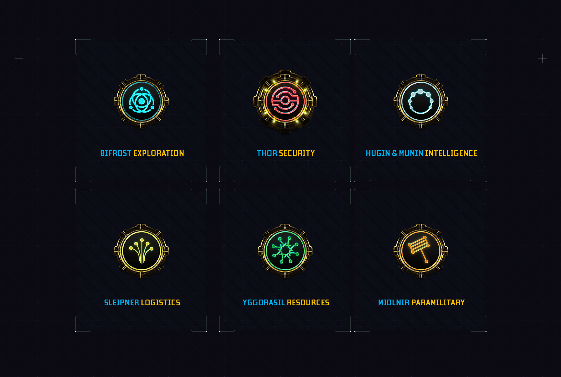
The division system was developed to give the community a clearer internal architecture. Rather than treating every member as part of an undifferentiated whole, the identity introduces distinct roles, responsibilities, and symbolic categories. This creates a stronger sense of order and makes the community feel more intentional, credible, and scalable. Visually, each division extends the core language while maintaining enough distinction to support recognition and orientation.
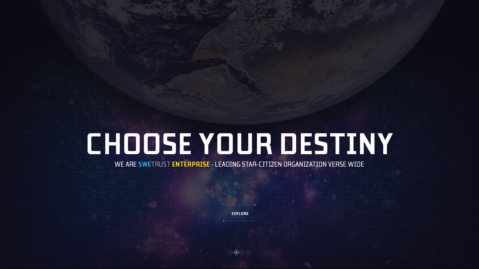
Defining a palette between heritage and technology
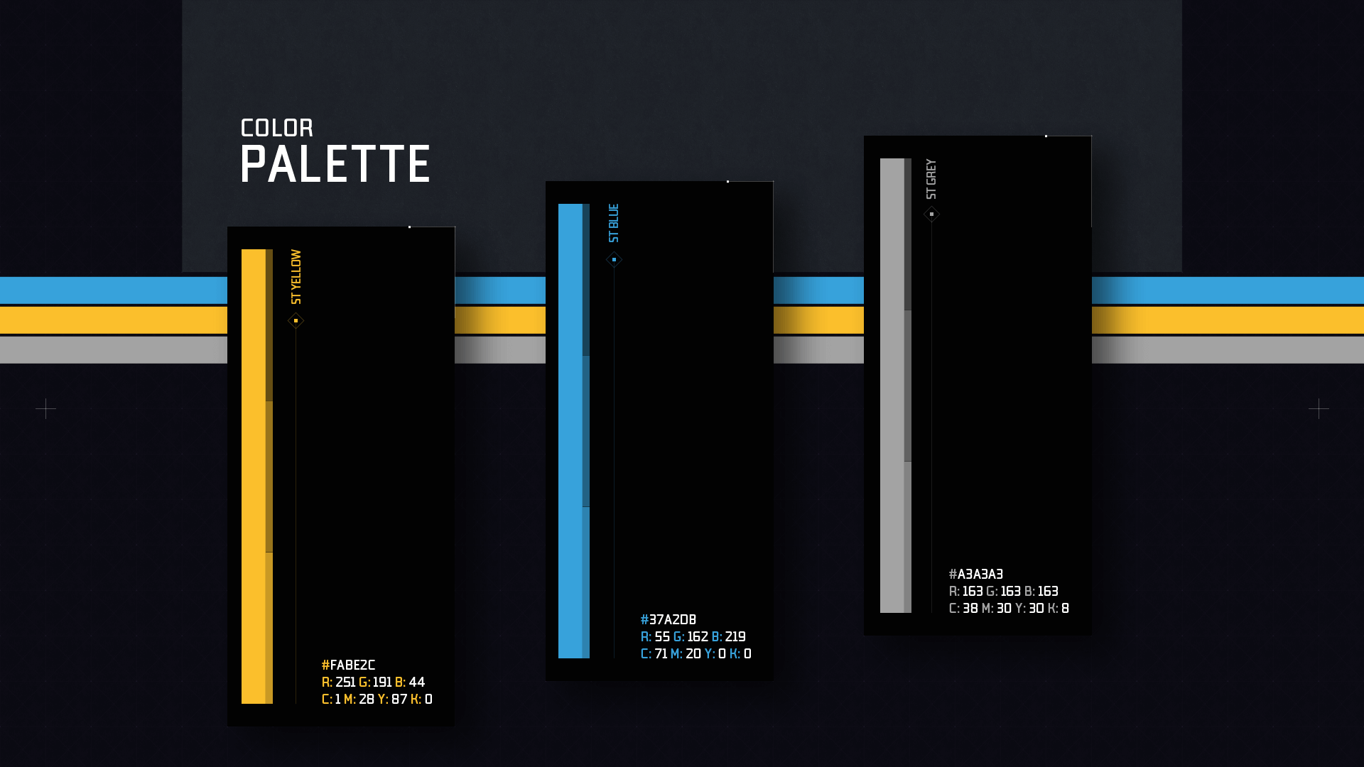
The color system was designed to balance two key references: Nordic identity and futuristic interface culture. Cooler blues introduce clarity, depth, and a technological tone, while warmer gold accents bring hierarchy, symbolism, and a sense of ceremonial value. Together, the palette supports both atmosphere and function — helping the identity feel immersive, recognizable, and adaptable across different applications. It creates a visual tension between ancestry and progress, which sits at the core of the project.
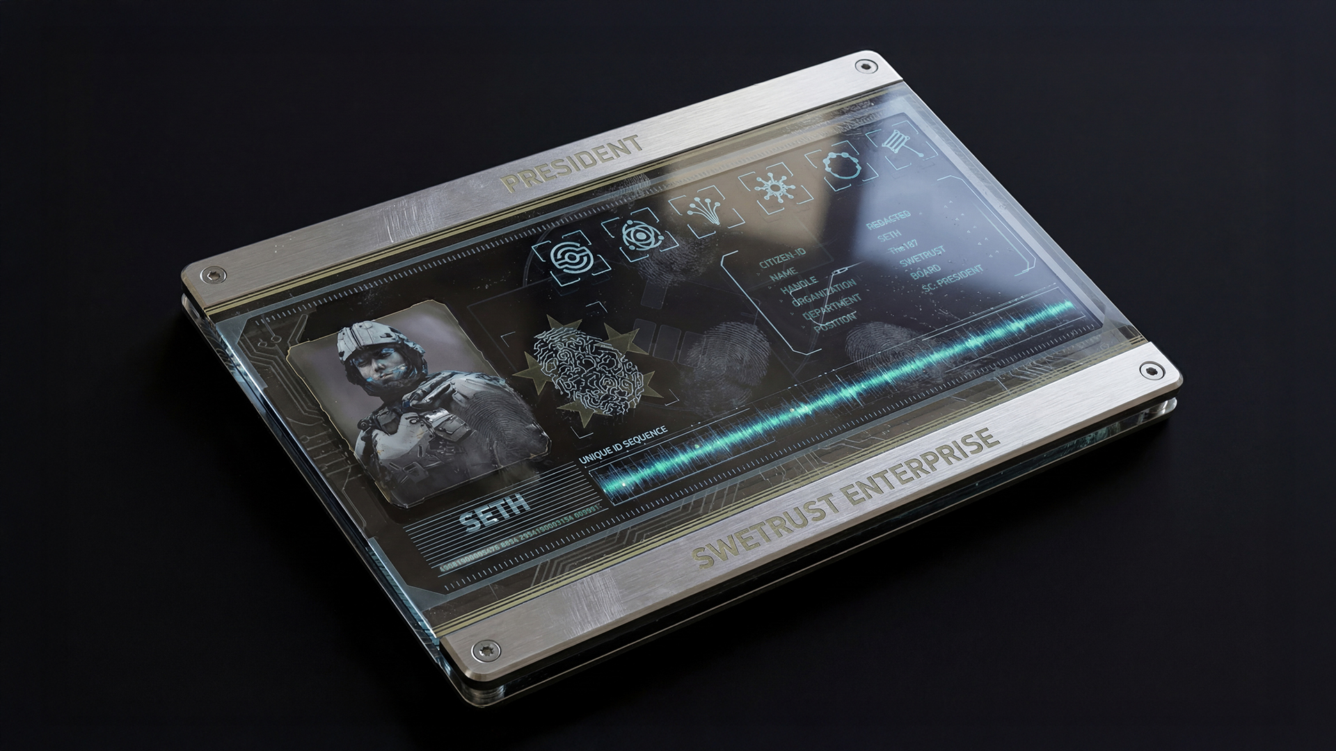
Turning identity into artifact
One of the most rewarding parts of the project was translating the visual language into object-like applications that feel native to the world they belong to. Screens, cards, and interface-inspired assets help bridge the gap between branding and fiction, making the system more tangible and immersive. These applications show how the identity can move beyond a logo into something members can imagine using, carrying, or encountering in context. That shift from graphic design to believable artifact gives the project much of its depth.